Initial Impressions of Light Table IDE
Light Table is a programming integrated development environment (IDE). But it’s a little different compared to what is currently out there. The author, +Chris Granger, has focused on what we are creating rather than getting to the creation. If that concept doesn’t quite make sense in your head, don’t worry. It’s visual. Think real-time flow of your program. If you want to watch how a value changes as it moves through your program you can see it in real-time. Bret Victor gave a great talk on the idea called Inventing on Principle. Light Table extends this concept and the roadmap for development has a lot of nifty fun features of programmers.
I love UX/UI. Especially when it makes stuff easier/faster/better. Light Table is basically IDE porn.
I don’t think I can really describe it better than that, but I’ll try to explain some things I like and where it has some room for improvement. I have been using it as a primary editor for VB.Net, Python (Django), and a little JavaScript for nearly a week. VB.Net is my day job, the others are for projects at home. For the most part I work in Sublime Text 2, which is a fantastic editor. If you haven’t checked it out before the go grab it and start playing. It’s extensible, built in Python, and has tons of plugins available. And yes, I write VB in it. It supports VB Script which is good enough. I switch back and forth between Visual Studio and Sublime Text 2 depending on what I’m working on.
Welcome Screen
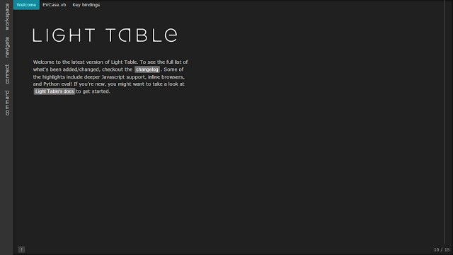
So clearly minimalism is heavily at play here. I’m a fan of minimalism, so this
works for me. What you see at the top are tabs. They’re unobtrusive. You’ll
notice I’m in full screen mode here, or as I like to call it: Stop messaging me
on Google Talk mode. You can hit ctrl + enter and it pops up the command
prompt so you can be handsfree. Which I like. Granger is a fan of VIM so there
are vim bindings that can be enabled. But I like his theory that the future of
editing code can’t always just be that the vim, emacs, etc style of only text
visualization is the answer forever.
Command Bar
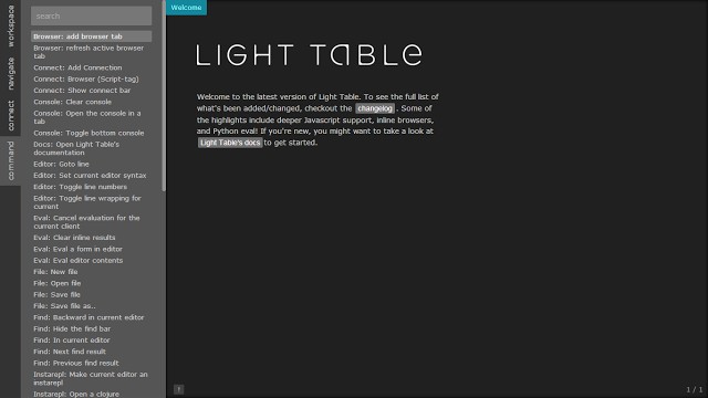
The UI is clean and simple. After all, you don’t need a ton of features to get your work done. The workspace tab allows you to bring files into the “workspace” which is kind of like open folder for Sublime Text 2. What’s different is that you can add files or folders to this workspace from all over the place. Then those files all show up on the quick open stuff under navigation which we’ll get to.
Light Table Workspace
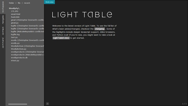
So any of those files on the left, or if you have multiple folders can be removed from the workspace without affecting your files on disk. Handy feature. But also, you can just add another folder or files to the workspace. And everything is available to open. Double-clicking any of the files on the left will open them for editing in the current tabset on the right. Tabsets are like groups of tabs. You can subdivide so you can have multiple tabsets each with multiple tabs.
From there we can move on to the navigate tab. It basically shows you all files in all folders. Let’s look at a django project.
Light Table Navigate
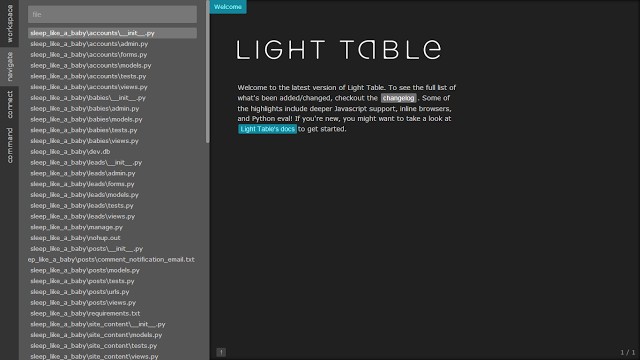
One of the great things about more and more programs is the support for fuzzy search. This makes using command bars and file openers incredibly easy but it also makes search in general better regarding programming languages. You may have 10 methods with Get as the beginning like GetMyFoo, GetNewBars, etc. But if you want GetMyFoo, you can just search for Foo. Fuzzy search will find it. That concept can be expanded on drastically in practice and in different concepts (command bar for instance, file names, settings, and your code itself) and you get some pretty awesome results. I’ve loved that in Sublime Text 2 and I’m loving using it in Light Table.
The default them is also pleasant for code. It’s not terribly high contrast but I find it’s easy on my eyes in a dark room. And let’s be honest. We program in the dark a lot. But my other favorite monokai is on there and switching is a command and a few keystrokes away so I don’t mind switching back and forth.
Light Table Default Theme

If you watch the videos you’ll see some of the wonderful things Light Table can do, but I think the best thing going for it right now is the incredibly responsive development. I’m not sure if +Chris Granger is working solo or if he has assembled a team, but I watched the repo on GitHub for issue tracking and I’m getting a lot of mail which is Q&A and feature suggestions and bug fixes. I love that part of it. I’m actually learning more about the editor just by watching the “issues” emails come across.
I think that’s all I’ll go into for now. I’m using it as the IDE of choice for a Django project at the moment and it’ll be interesting to see what ultimately I like and dislike at the end of that. Code Mirror’s underlying editor has a few bugs with the syntax in VB, but I have a feeling some of the features the community requests will be easy to address once the plugin system is live, which is forthcoming in 0.5. I’m already wondering if I can build out some Django tools for the editor, even though I’m not sure what that would look like. It supports virtualenvs for python, although I haven’t tried it. Django work means I’m not really doing eval much unless I’m just quickly testing pieces of a function.
I’ll post again once I have had the opportunity to really spend a lot of hours in it. For now, I really enjoy it. I miss some of the conveniences of Sublime Text 2, but they’re not anything that can’t be resolved. And for an alpha…this product has definitely caught my attention. I look at it and all I can think is how amazing this is going to be.
